Challenge
A feature-heavy design studio overwhelmed users and limited creative freedom.
Tynari's Design Studio had outgrown its original experience; users had powerful tools, but creating artwork felt more technical than creative. I redesigned the studio from the ground up, turning a feature-heavy platform into an intuitive creative space where users could design products with ease.
A feature-heavy design studio overwhelmed users and limited creative freedom.
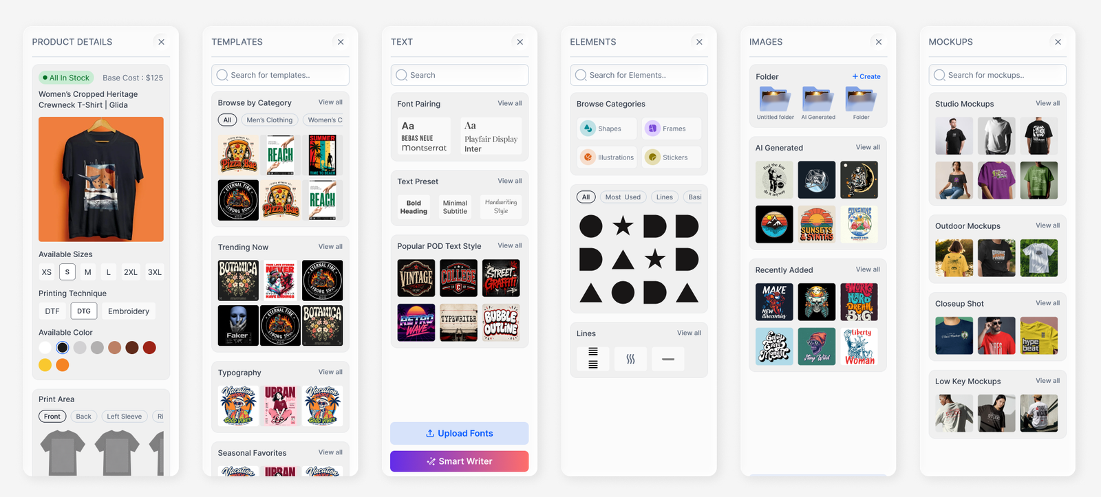
Replaced complex workflows with intuitive templates, creative elements, typography, and AI-powered design generation.
Shifted the experience from navigating tools to creating artwork effortlessly.
A more intuitive design experience that empowered users to turn ideas into personalized, product-ready artwork.
Tynari is a print-on-demand platform that empowers artists, influencers, and businesses to transform
their creativity into personalized products for personal use, gifting, and merchandising.
The user journey begins on the landing page, moves to the product catalogue, where users select products
based on their preferred colors and sizes, and leads to the heart of the platform: the Design Studio,
where ideas come to life.
While the flow seemed intuitive on paper, the experience told a different story. For users with little or
no digital design experience, the Design Studio felt overwhelming, turning what should have been a
creative process into a complex, tool-heavy experience.
Failing the 5-Second Test: When Users Couldn't Understand the Product
“The Design Studio feels like a tool-heavy platform, almost like AutoCAD.”
User interviews
revealed that the Design Studio felt complex and intimidating across user segments.
The
key insight: Users came to create, not to navigate a complicated design tool.
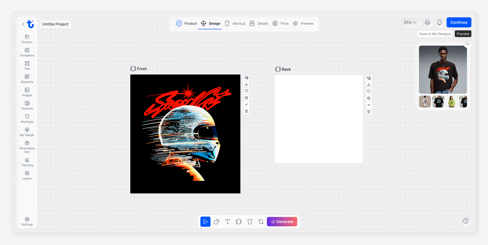
A More Spacious Artboard
I removed the right-side panel to give the artboard more breathing room and establish it as the
primary focus of the experience. This also encouraged users to experiment freely, preview their designs,
and explore different product sides within a single workspace.
Choosing a Direction That Makes Designing Feel Effortless
We explored different approaches to simplify the Design Studio, evaluating how each direction could
improve usability, creative freedom, and the overall design experience while remaining feasible to build.
The Design Studio offered a wide range of creative tools, but needed a more intuitive structure to make
them accessible without overwhelming users.
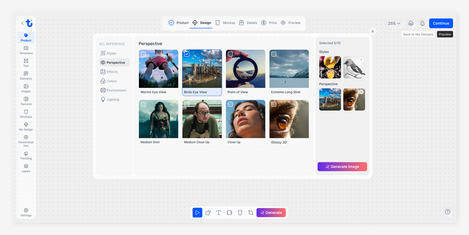
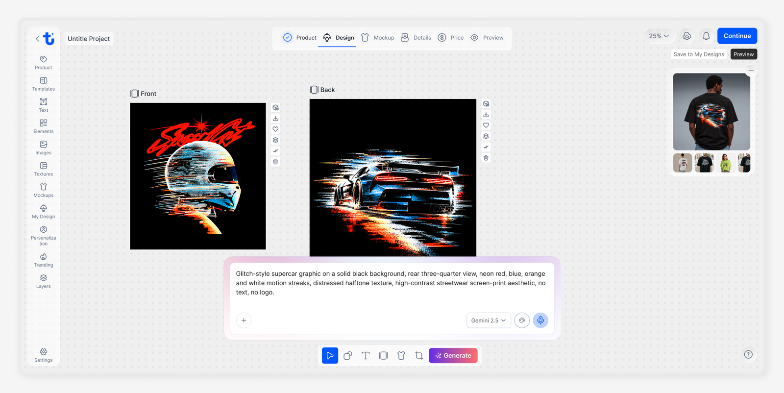
I introduced a modular, panel-based navigation system that organizes essential tools into dedicated sections, creating a more intuitive and focused design experience.
The AI-powered prompt box allows users to turn their ideas into designs by describing what they envision,
refining prompts with AI, and exploring different creative styles. The intuitive interface makes AI design
generation more accessible, even for users with little or no design experience.
The real-time product preview brings these designs to life on realistic product mockups, allowing users to
explore different product views, visualize how their artwork looks on the final product, and make
adjustments before finalizing their designs.
The redesigned Tynari Design Studio made the creative process more intuitive, increased engagement, and encouraged users to explore and launch more designs.
Bounce rate reduced from 75%
Increase in user engagement
Increase in product launches and design element usage
A simpler, more focused design experience
AI tools help users bring ideas to life while keeping creative control in their hands.
A clear, intuitive interface helps users focus on creating rather than figuring out the tools.
Real-time product previews help users visualize designs and make informed decisions.