3 Core Collaborators
Product Stakeholders · Marketing · Engineering
Tynari is a creator focused marketplace connecting creators, influencers, businesses, and individuals for gifting, collaborations, and product discovery. I worked across the marketplace and dashboard experience, turning a broad set of user needs into a more structured and consistent product experience.
Making Tynari Feel Like a Creative Ecosystem, Not Just a Print-on-Demand Platform.
Tynari had everything creators needed to bring an idea to life, but the landing page wasn't making that value obvious enough. Visitors could see the platform, but they didn't immediately understand why it was built for them.
The experience needed to answer three simple questions quickly: Who is
Tynari for? What can I do with it? And why should I care?
We identified five key challenges:
1. Unclear Positioning : Tynari served artists, creators, and
businesses, but it wasn't
immediately clear who the platform was really built for.
2. Too Much Explaining : The page talked about products, tools, and
features, but didn't
show enough of what users could actually create with them.
3. Disconnected Sections : Each section worked on its own, but they
didn't always feel
like parts of one connected story.
4. Not Enough Creative Connection : The experience explained what
Tynari does, but didn't
create enough excitement around what users could achieve with it.
5. Feeling Like a Printing Platform : The experience could easily be
perceived as another
print-on-demand service instead of a platform where creators can create, personalize, and build something
of their own.
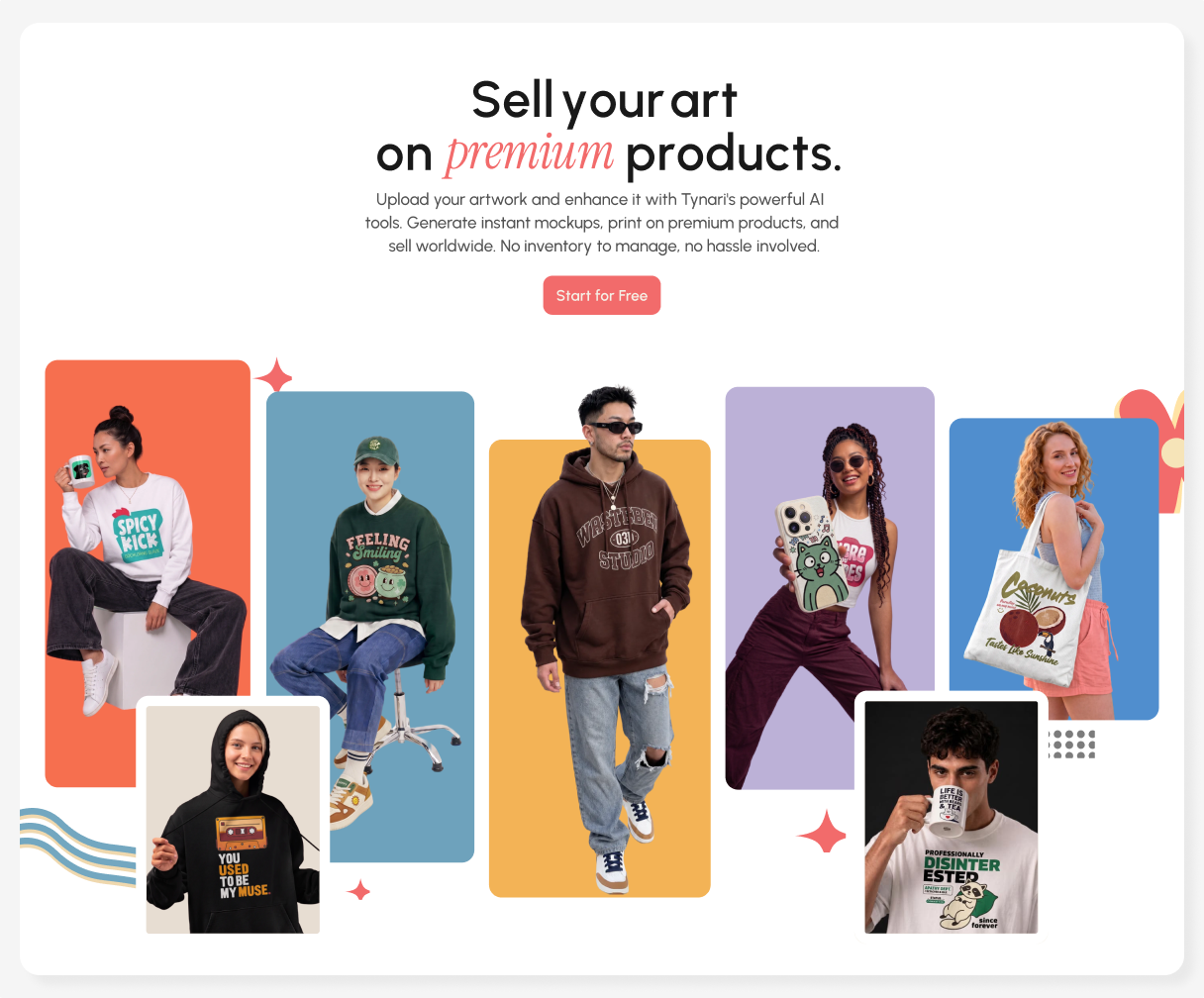
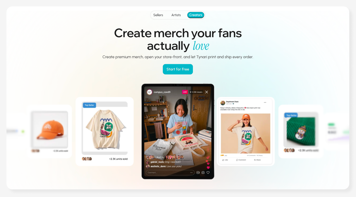
I explored two hero directions based on a simple idea: the value of Tynari changes depending on what the
creator is trying to achieve.
For Artists - “Sell your art on premium products.”
The artist direction leads with creative expression. I used artwork, creators, and physical products
together so users could immediately connect the dots between what they create and what they can sell.
The goal was to make Tynari feel like a platform for building something around your art, rather than
simply printing it.
For Creators - “Create merch your fans actually love.” The creator direction starts with audience and monetisation. I used social content, creator imagery, and product visuals to communicate the relationship between content → audience → merch without explaining the entire workflow through copy. The goal was to make the business opportunity understandable at a glance.
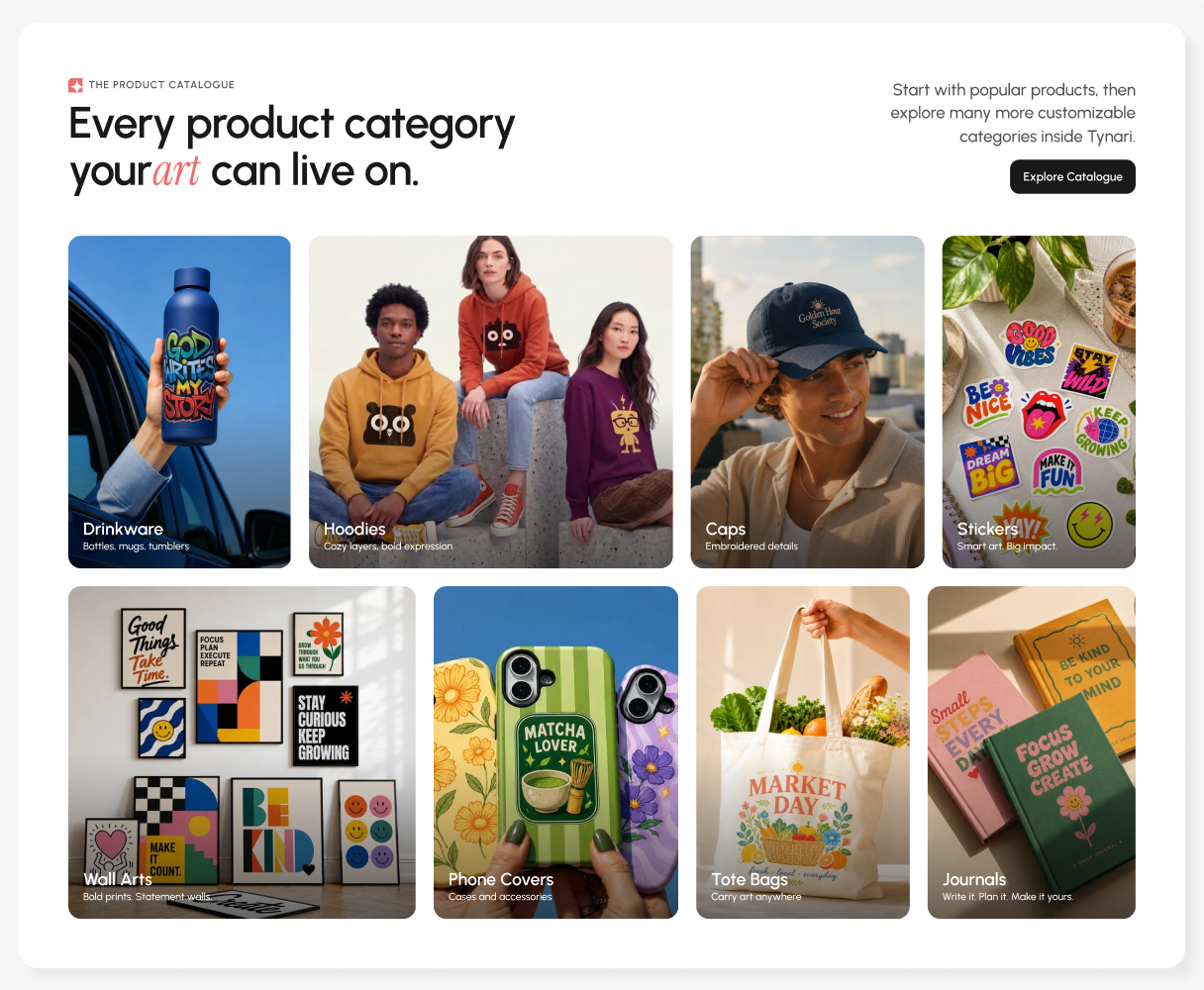
The catalogue was designed to show users the possibilities of what they can create, rather than simply
listing Tynari’s products.
Instead of a traditional product grid, I used large, visual cards with real-world imagery and short
descriptions to make each category immediately understandable. Popular products are introduced first,
while the wider catalogue remains easy to explore.
This helped drive a 2× increase in product launches and design-element usage, giving users more opportunities to explore, create, and sell across Tynari’s product range.
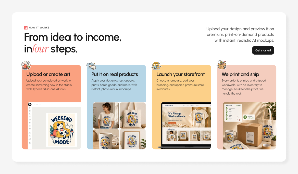
Rather than presenting the four steps as a traditional process, I treated each card as a self-contained
moment in the user journey, pairing a clear action with a visual outcome.
The flow moves naturally from creation → product → storefront →
fulfilment, while the consistent
text-and-visual structure keeps each step easy to scan.
The goal was to make a complex workflow feel simple, visual, and easy to understand at a glance.
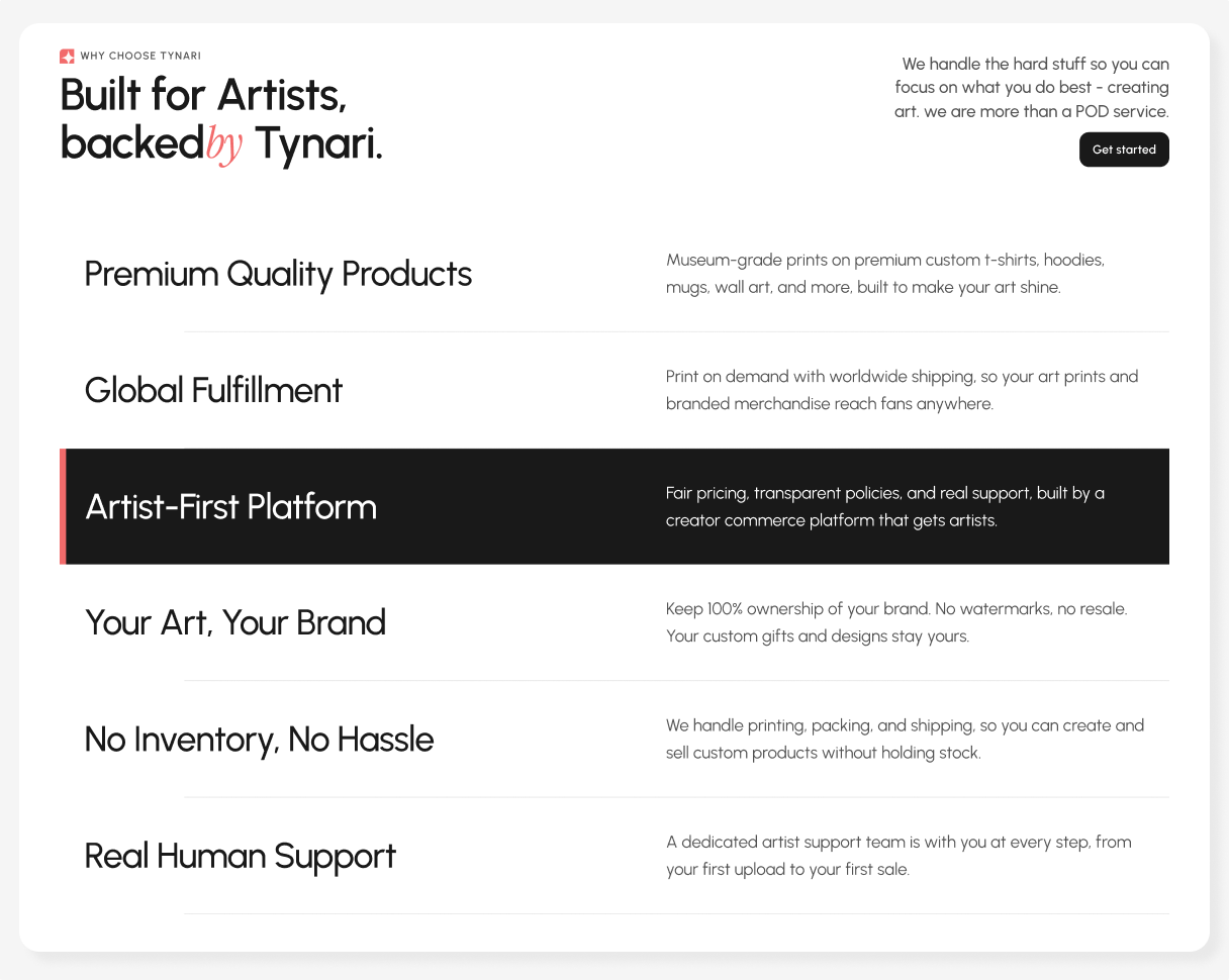
This section was designed to answer the next question users naturally have after understanding the
product: “Why should I choose Tynari?”
Instead of presenting the benefits as a traditional feature list, I structured them as clear value statements with a consistent two-column layout strong headline
on the left and supporting context on the right.
The “Artist First Platform” became the core differentiator, supported by quality, fulfilment, ownership, and simplicity. The section stays lightweight and scannable, quickly showing what Tynari offers and why it makes the creator journey easier.
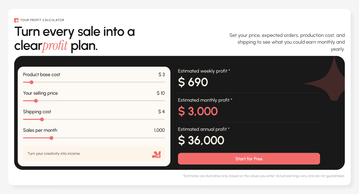
The calculator helps users understand their potential earnings without doing the math themselves. Instead of reading pricing tables or calculating margins manually, users can adjust key variables and see the outcome instantly.
The goal was to turn a complex financial decision into a simple “adjust → see → understand” interaction.
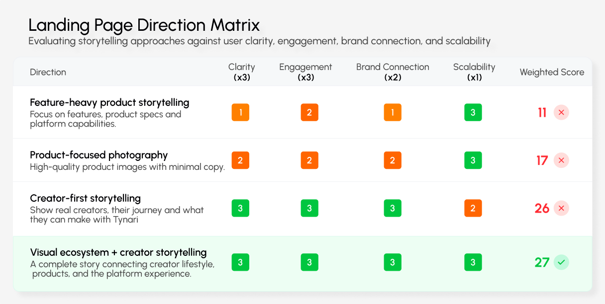
Instead of choosing a visual direction based purely on aesthetics, I evaluated different approaches against what the landing page needed to achieve: clarity, emotional connection, product understanding, and ease of exploration.
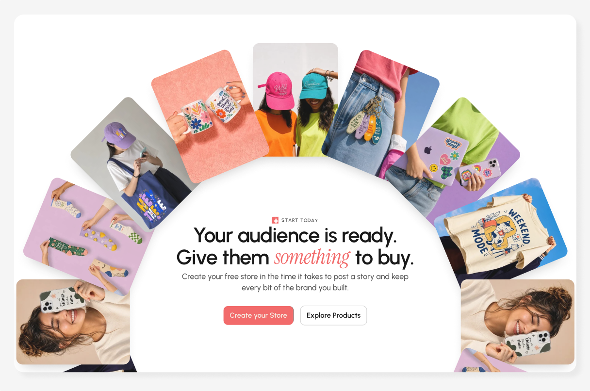
This section closes the landing page by bringing the creator journey back to its starting point:turning an audience into something tangible.
The product imagery reinforces Tynari’s possibilities, while the two CTAs support exploration and action. The circular layout creates a strong closing moment before the footer.
Design, product, and development worked as one loop, keeping the marketplace experience aligned from concept to implementation.
Product Stakeholders · Marketing · Engineering
Worked closely with stakeholders to translate business goals into clear creator and buyer experiences.
Aligned the marketplace story, visual language, and content around Tynari’s creator first positioning.
Used rapid feedback loops to refine flows, hierarchy, and interactions before handoff.
Delivered structured, implementation ready designs with clear states and reusable components.
The redesign positioned Tynari more clearly as a creator-first platform, making it easier to understand, explore, and move from product discovery to creating a store.
Potential improvement in product discovery through clearer hierarchy and navigation
Potential increase in store creation intent through stronger CTAs and clearer value communication
Potential reduction in drop off by simplifying the path from discovery to action
Unified creator journey connecting discovery, products, and store creation
Clear positioning makes Tynari easier to understand.
Show what creators can achieve before explaining how it works.
Connect discovery, creation, and selling in one journey.